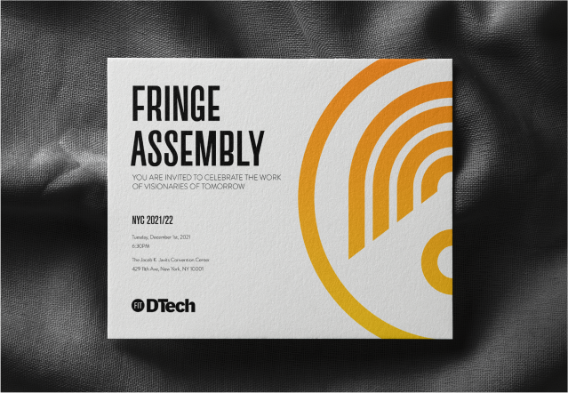
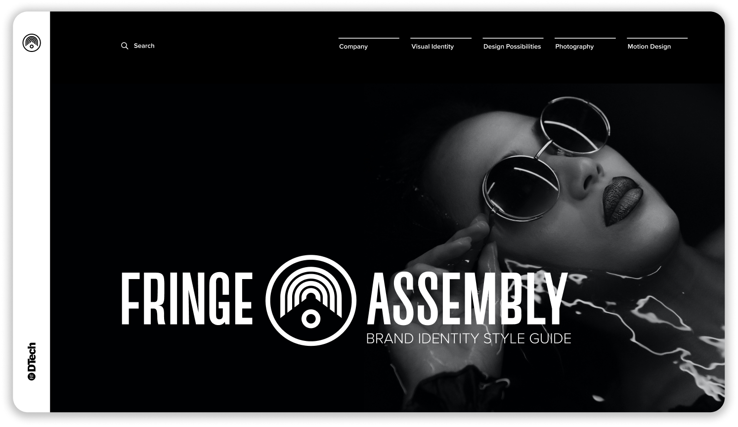
FRINGE ASSEMBLY
Brand Identity
A Identity system for a new clothing brand created by DTech that will give young fashion designers a platform for their collections.
Team:
C.J.Yeh
Christie Shin
Osvaldo Aguilar
Yuliya Kosheeva
C.J.Yeh
Christie Shin
Osvaldo Aguilar
Yuliya Kosheeva
Duration:
4 Months
4 Months
Role:
Designer, Motion, Strategy
Designer, Motion, Strategy
Fringe Assembly
The Fringe Assembly logo mark is inspired by the blueprint of the assembly hall designs.

Brand Typeface
Custom Typeface: Akzidenz-Gravity
Custom Typeface: Akzidenz-Gravity
The primary typeface of the brand is Akzidenz-Gravity, a custom typeface based on Akzidenz-Grotesk-Medium Condensed Alt. Akzidenz-Gravity is unique in its confident and bold look. The lowering of the center point gives it a rebellious yet steady look and feel.
Logo


Logo Breakdown
Read More ︎
Read More ︎
Application


Usage
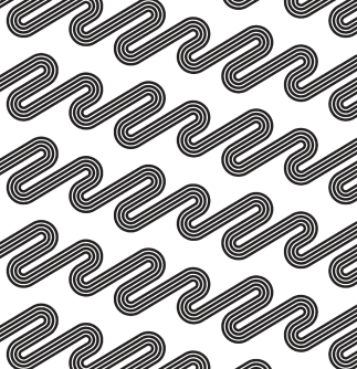
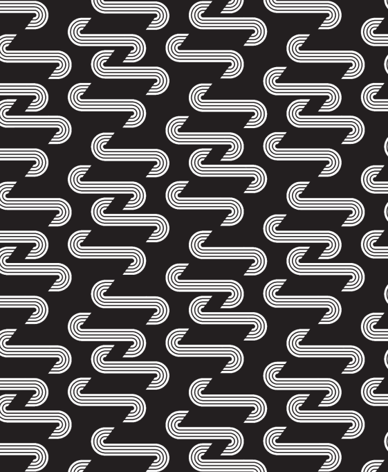
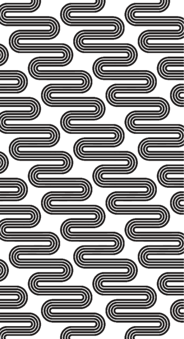
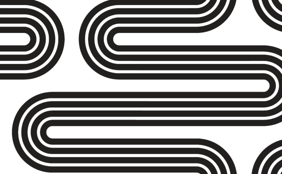
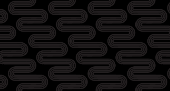
Our patterns mimic and embrace the style and curves of Fringe Assembly logomark and therefore can be used as a strong brand asset. We are confident that the curvy lines will turn into the brand’s signature.


Clothing Tags
Soft and wavy patterns are intended for smaller mediums, such as clothing tags.

Shopping bags
We recommend using a bold zig-zag pattern (pattern 1) for packaging, to make regular shopping bags stand out and look unique. For a stylish and sharp look use pattern 3.


Clothing Lining
Patterns 4 and 5 can be used as lining patterns for garments.


Stationary:
Use patterns for stationary designs to maintain brand consistency.
Ex: invitation envelopes, business cards.
Digital Identity Style Guide
Easy and accessible identity design style guide


︎
NEXT PROJECT