
Logo Breakdown
Primary logo
Pans primary logo allows each character to live independently of one another while emphasizing their ability to collaborate, forming a unique whole. In its display of singularity and togetherness, it is a symbol of pans success and its principles for continual impact on the experimental genre. pans custom typeface ‘collision one’ is utilized for the characters for its structure in precise geometry.
Type logo
An expanded letter form of the logo, highlighting the structure
of each character as it stands alone. practicality and readability
is prioritized.
Icon logo
A condensed flat view of each character of p-a-n coming together, forming a unique and unified whole.


Correct use of brandmarks
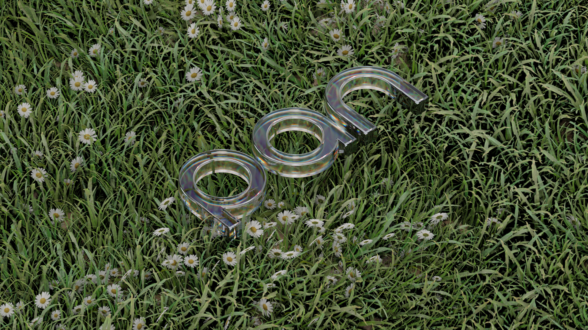
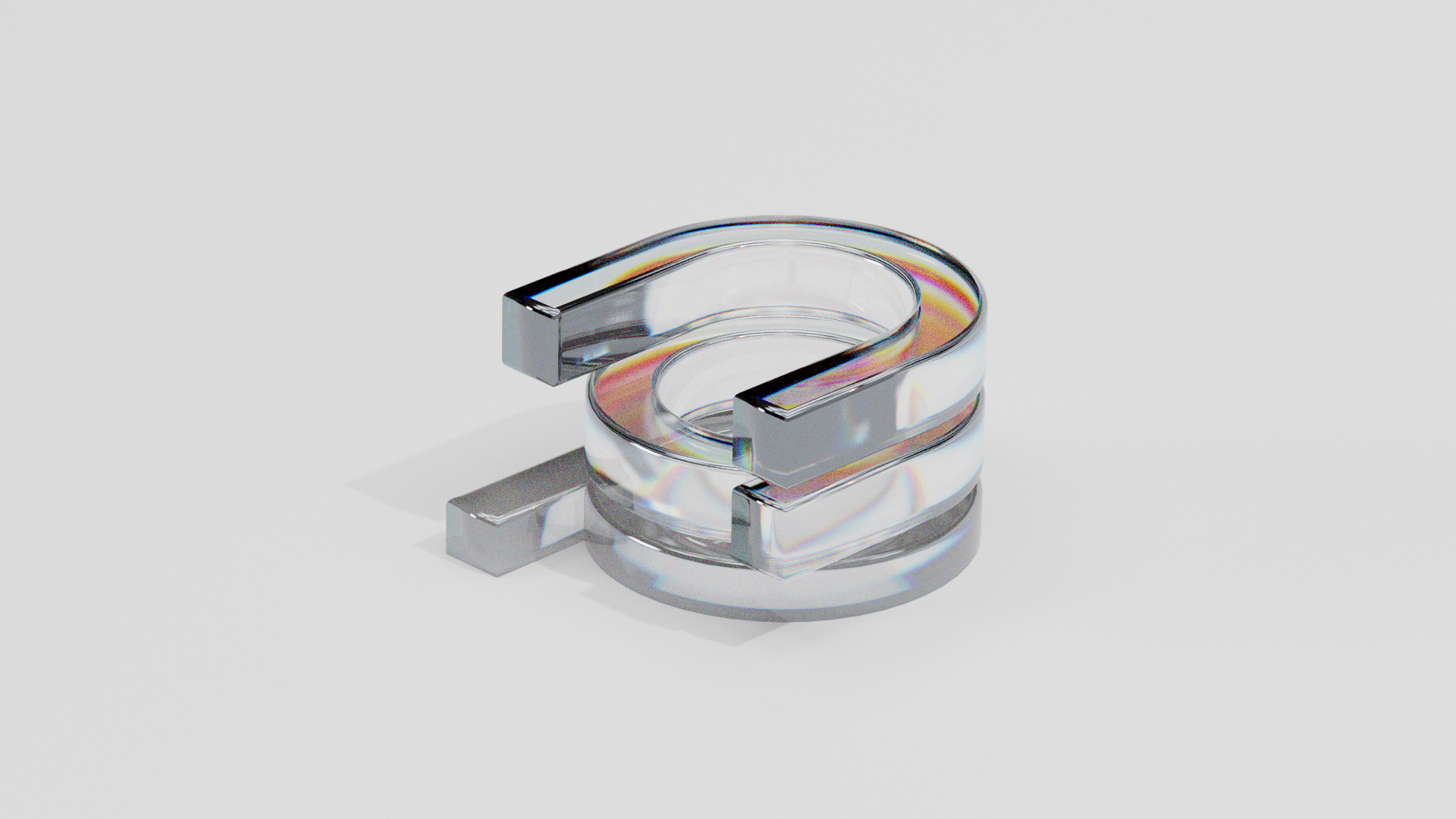

Graphic
Our secondary graphics expand on the two-dimensional graphics, elevating them to objects that take up space in their three-dimensionalities. Their purpose is to aid in the communication of experimentation within the brand. There are no restrictions to the 3D logo design render & its style is left to the decision of the creative.
BACK TO PAGE ︎︎︎